
Meet Blowfish Emporium
Blowfish Emporium began in a quirky, southern living room of sister art aficionados over several bottles of wine and a Bob Ross tutorial. The idea to curate vintage, reclaimed, and custom art and decor evolved into a weekend farmer’s market hobby that took off. Finding a Main Street location to fill with designed pieces from Herman Miller to American impressionism required a rebrand – as did their increasingly tasteful clientele.


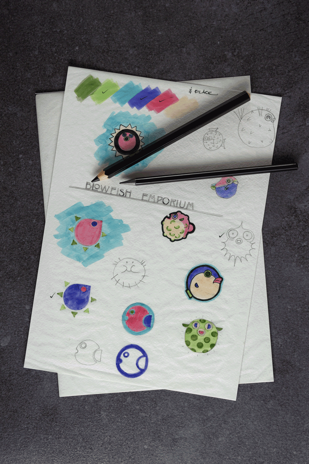
Their new Main Street store, in a revamped, early 20th century building, deserved an equally quirky brand presence, and the sisters behind Blowfish tasked Strang Creative to update and help share their complex story. We worked to ensure the color story and typography reflected not only the quirkiness of the regional, turned high-end, emporium but also the character of the art deco building to be inhabited. The inspiration and tone were pulled from Art Deco palettes and typography with a hint of geometric abstraction in the brand’s icon – a meld of styles and funky colors intended to attract and inspire.